Table of Contents
Surface Types and Interaction Models
Surface Types and Interaction Models
CLI applications can use different surface types to present information and handle user interaction. There are three main surface types:
Alternate Buffer
You swap the whole surface. This completely replaces the terminal content with your application interface.
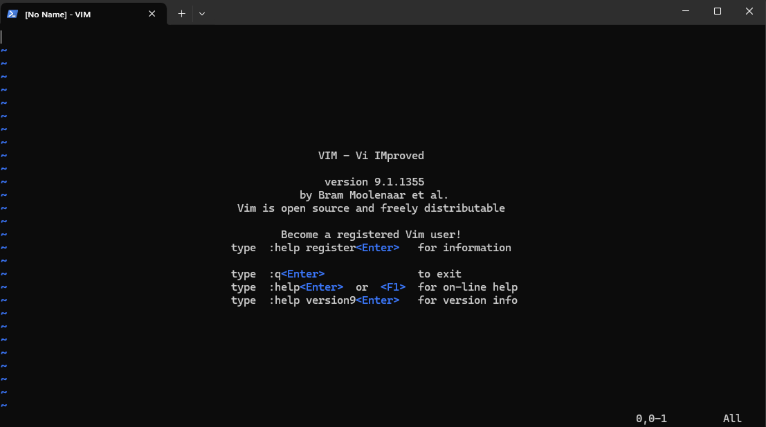
The alternate buffer completely replaces the terminal content, providing a full-screen interface for the application. When you exit, the previous terminal content is restored.
When to use:
- Complex interactive applications
- Full-screen editors or viewers
- Applications with extensive UI elements
- When you need complete control over the display
Examples: vim, nano, htop, less
Side Panel
Splits the terminal into multiple areas. Currently AI Shell is using this approach for contextual information.
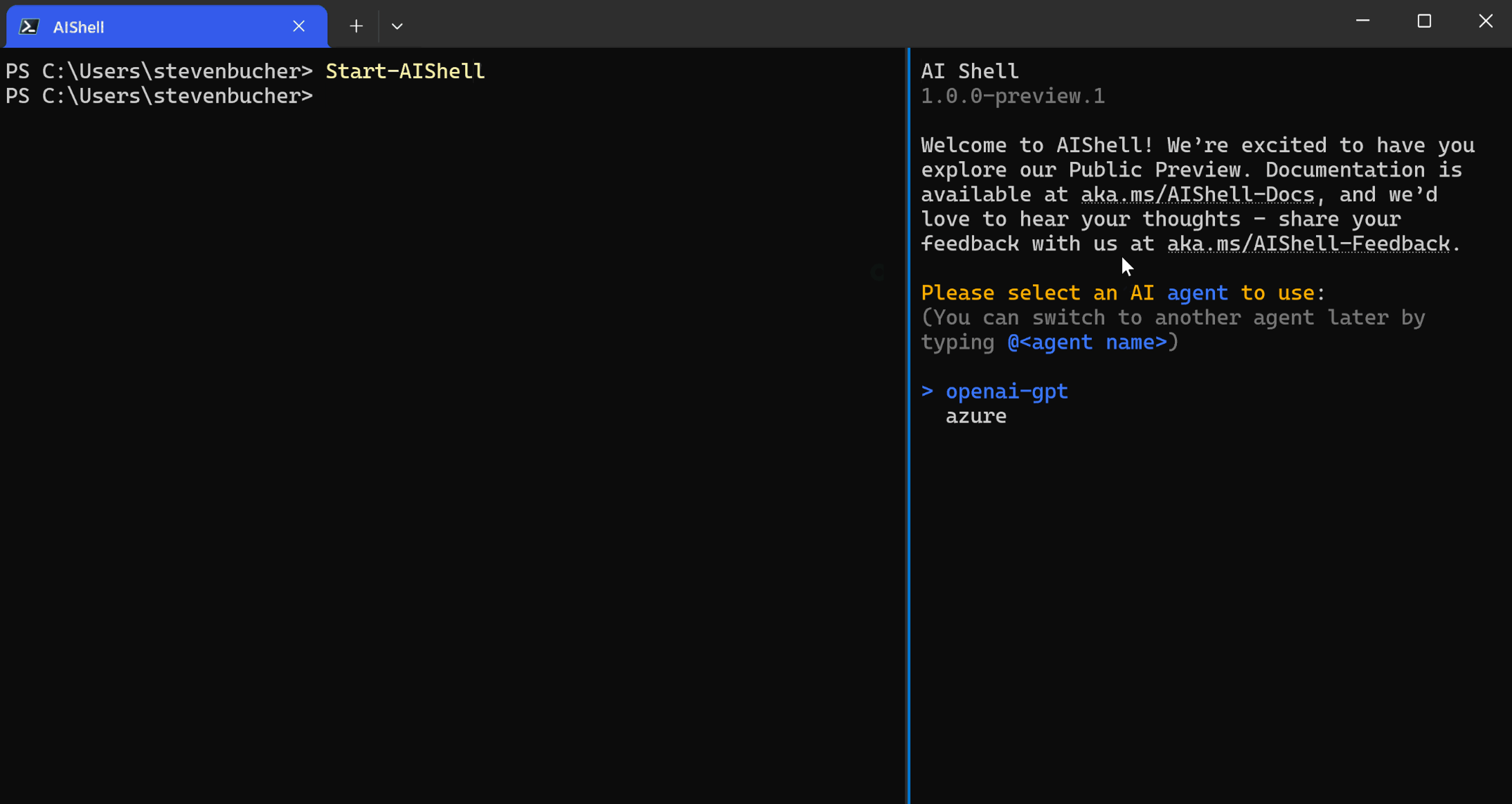
The side panel splits the terminal into multiple areas, allowing contextual information and AI assistance to be displayed alongside the main command interface.
When to use:
- Contextual information display
- Real-time monitoring alongside commands
- AI assistance or suggestions
- Multi-pane information views
Examples: AI Shell, some file managers
Inline
Integrates directly into the command line flow. This is how Github Copilot interaction works in CLI.
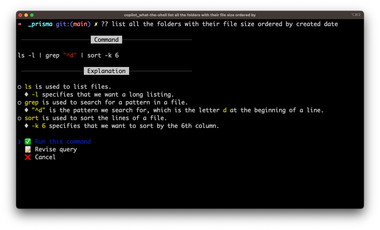
Inline suggestions integrate directly into the command line flow, providing contextual help and completions without interrupting the user's workflow.
When to use:
- Command completion and suggestions
- Progressive disclosure of information
- Contextual help that doesn't interrupt flow
- Quick confirmations or choices
Examples: GitHub Copilot CLI, autocomplete systems, inline prompts
Choosing the Right Surface
The choice of surface depends on your application's needs and user interaction patterns:
Decision Framework
- Complex UI needed
- Full user attention
- Rich interaction
- Self-contained app
- Contextual information
- Parallel workflows
- Monitoring + commands
- AI assistance
- Minimal interruption
- Quick interactions
- Command augmentation
- Progressive enhancement
Implementation Considerations
Technical Requirements
- Alternate Buffer: Requires terminal escape sequences, signal handling
- Side Panel: Complex terminal manipulation, layout management
- Inline: Cursor positioning, partial line editing
User Experience
- Alternate Buffer: Immersive but can be disorienting
- Side Panel: Efficient but requires wide terminals
- Inline: Natural but limited information display
Compatibility
- Alternate Buffer: Widely supported
- Side Panel: Requires advanced terminal features
- Inline: Works in most terminals
Hybrid Approaches
Many modern CLI applications combine multiple surface types:
# Example: CLI tool that adapts based on context
$ myapp status                 # Inline output
$ myapp status --watch          # Side panel monitoring
$ myapp configure              # Alternate buffer for complex setup

# AI-enhanced commands
$ myapp deploy                 # Inline suggestions during typing
$ myapp deploy --interactive   # Alternate buffer for guided setup
💡 Design Principle
Choose the surface type that best matches your user's mental model and workflow. Inline for quick tasks, side panels for contextual assistance, and alternate buffers for focused work sessions.
Selection in List
When providing items for users to choose from, design selection interfaces that work for all users, including those using screen readers and assistive technologies.
Selection Methods
There are multiple interaction methods for selecting items in a list:
Arrow Key Navigation
Allow users to navigate through options using up/down arrow keys for interactive selection.
$ deploy select-env
Select environment:
❯ Development
  Staging
  Production
Number-Based Selection
Provide numbered options so users can directly enter a number to make their selection.
$ deploy select-env
Select environment:
1. Development
2. Staging
3. Production

Enter selection (1-3): _
Accessibility Considerations for Screen Reader Users
1. Always Number Your List Items
Add numbers to every list item, regardless of which interaction model you use.
Without numbers, screen reader users may not know which item their cursor is focused on. In some cases, the screen reader will read all selection items each time a user moves the arrow, making navigation tedious and confusing.
# ❌ Bad: No numbers - unclear which item is focused
$ deploy select-environment
Select deployment environment:
> Development
  Staging
  Production
  Testing

# ✅ Good: Numbers help screen readers identify position
$ deploy select-environment
Select deployment environment:
> 1. Development
  2. Staging
  3. Production
  4. Testing

(Use arrow keys or enter number 1-4)
2. Show All Items Upfront
Screen reader users prefer to hear all items upfront rather than navigating through paginated lists.
For lists up to approximately 25 items, display them all at once. Users prefer to listen to all options and then provide a number to select, instead of breaking the list into multiple pages.
# ✅ Good: All items visible (up to ~25 items)
$ deploy select-region
Select deployment region:
1. us-east-1
2. us-west-2
3. eu-west-1
4. eu-central-1
5. ap-southeast-1
6. ap-northeast-1
... (up to ~25 items)

Enter selection (1-6): 3

# ❌ Avoid: Paginated lists for smaller sets
$ deploy select-region
Showing regions 1-3 of 6
1. us-east-1
2. us-west-2
3. eu-west-1

Press 'n' for next page or enter selection:
Output Formatting
Design output that works for both human users and script consumption. When your command returns structured data, consider where you place human-readable messages.
Message Placement with Structured Output
When your command returns structured data (like JSON), the placement of human-readable messages affects both user experience and script parsing.
The Problem: Auto-scrolling
If your command returns lengthy structured output, messages placed before the output will auto-scroll away and can be missed by users.
# ❌ Message gets lost due to scrolling
$ mycommand
Resource created successfully!
{
  "id": "resource-123",
  "name": "my-resource",
  "properties": {
    // ... many lines of JSON ...
  }
}
The Solution: Messages After Output
Place human-readable messages after the structured output so users see them at the end where their eyes naturally land.
# ✅ Message visible at the end
$ mycommand
{
  "id": "resource-123",
  "name": "my-resource",
  "properties": {
    // ... many lines of JSON ...
  }
}

Resource created successfully!
Case Study: Azure CLI and PowerShell
Azure tools demonstrate different approaches to the same challenge:
Azure PowerShell Approach
Azure PowerShell returns a table format for the object, optimized for human readability:
PS> Get-AzVM
Name    ResourceGroup    Location    Status
----    ---------------  ----------  --------
vm1     myRG            eastus      running
vm2     myRG            westus      stopped
Azure CLI Approach
In Azure CLI, when Azure resources are created successfully, the command returns the JSON object. This object can get quite lengthy. So when showing messages that need to be read by users, it's better to add it at the end of the JSON object. Otherwise, it will auto-scroll to the bottom and the message can be dismissed.
Azure Login Example (past design iteration, not currently shipped):
In az login, when we used to show JSON objects of all the subscriptions and I wanted to add a custom message, this was the approach I explored:
$ az login
[
  {
    "cloudName": "AzureCloud",
    "homeTenantId": "12345678-1234-1234-1234-123456789012",
    "id": "87654321-4321-4321-4321-210987654321",
    "isDefault": true,
    "name": "My Subscription",
    "state": "Enabled",
    "tenantId": "12345678-1234-1234-1234-123456789012",
    "user": {
      "name": "user@example.com",
      "type": "user"
    }
  }
]

You have logged in. Now let us find all the subscriptions to which you have access.
Design Guidelines
Message Placement
Put human-readable messages after structured output to prevent auto-scroll issues.
Script-Friendly Format
Use structured formats (JSON, XML) that scripts can easily parse and consume.
Clean Separation
Keep structured data separate from human messages so scripts don't need to filter content.
Consider Your Audience
Choose default output format based on whether scripts or humans are the primary users.
Terminal Display Differences
Consider this! Different terminals handle styling and formatting in various ways. Don't rely on specific visual styles to convey important information - what looks perfect in your terminal might be broken or confusing in others.
The Challenge: Style Interpretation Varies
The same CLI output can appear completely different across terminals:
⚠️ Common Style Misinterpretations
- Italic font can appear as blinking text in some terminals
- Bold font might render as brighter color instead of thicker text
- Hyperlinks display differently - some show dashed underlines, others show no line but reveal on hover
- Colors render with different palettes
Hyperlink Display Variations
Hyperlinks are particularly problematic because terminals handle them inconsistently. Here's the real-world compatibility landscape:
| Terminal | Hyperlink Display Style | Notes |
|---|---|---|
| iTerm2 (macOS) | Underlined + hover preview | Also allows Cmd+Click to open. |
| Windows Terminal | Underlined (or blue if styled) | Supports OSC 8 since v1.9. Can click links. |
| Alacritty | No native support (as of mid-2025) | Hyperlinks not displayed or clickable. |
Real Examples Across Terminals
Safe Design Patterns
Design your CLI output to work across all terminal types:
Don't Rely on Style Alone
Make important information visible without style
# Clear visual hierarchy
✓ SUCCESS: Deploy completed
✗ ERROR: Build failed
→ NEXT: Run 'logs' command
ℹ INFO: Check status page

# Alternative with brackets
[OK] Deploy completed
[FAIL] Build failed
[NEXT] Run 'logs' command

# ❌ Color-dependent
Deploy completed
Build failed
Provide Multiple Access Methods
For example, if your command outputs hyperlinks and it’s important that users can view or open them in all terminals, provide clear fallback methods.
# Multiple ways to access information
Documentation: https://docs.example.com
• Click the link above
• Run: myapp open-docs
• Copy URL to browser

# Clear fallback instructions
Test in Minimal Environments
Verify your CLI works in the most basic terminals
- Windows Command Prompt
- Basic Linux terminal
- SSH sessions
- Screen readers
- Text-only environments
Cross-Platform Compatibility
The Challenge: Terminal Capability Differences
Modern terminals have rich features like clickable links, but older terminals and different operating systems have varying levels of support. You need to design for the lowest common denominator while still providing enhanced experiences where possible.
Case Study: Intercept Survey Implementation
Here's a real example from Azure PowerShell showing how cross-platform constraints affect design decisions:
The Requirement
We needed to show an intercept survey message occasionally to gather user feedback. The survey should be easy to access but not disruptive to the workflow.
Initial Design vs. Reality
# What we wanted to do (doesn't work everywhere)
PS C:\Users\account> Get-AzVM
Name    ResourceGroup    Location    Status
----    ---------------  ----------  --------
vm1     myRG            eastus      running

📋 Click here to take our 5-minute survey # ❌ Not all terminals support clickable links
What We Actually Implemented
# Cross-platform compatible solution
PS C:\Users\account> Set-ExecutionPolicy -ExecutionPolicy RemoteSigned -Scope CurrentUser

[Survey] Help us improve Azure PowerShell by sharing your experience. This survey should take about 5 minutes.
Run 'Open-SurveyLink' to open in browser. Learn more at https://go.microsoft.com/?id=2349.

PS C:\Users\account>
Design Decisions Made
Bottom Placement
Show survey message at bottom of command output instead of top banner for cross-OS compatibility.
Command-Based Interaction
Use Open-SurveyLink command instead of clickable links for universal terminal support.
Cross-Platform Design Principles
Universal Compatibility Guidelines
- Test on multiple terminals - Windows Command Prompt, PowerShell, Terminal.app, various Linux terminals
- Provide fallback options - Commands instead of clickable links, plain text instead of rich formatting
- Use standard ASCII - Avoid Unicode characters that might not render consistently
- Check terminal capabilities - Detect support for colors, links, etc. before using them
- Design for the lowest common denominator - Ensure core functionality works everywhere
Automation Mode
The Design Mindset
When designing how a command works, remember that it might also be executed in a script. Commands often need to support automation. If you introduce a confirmation prompt, consider how it should behave in scripted scenarios. Should confirmation be enabled by default, or only when a specific parameter is provided?
The Problem
A command that works perfectly for humans can completely break automation:
# This works great for humans
$ deploy-app
Are you sure you want to deploy to production? (y/N)
> y
Deploying...

# But breaks scripts - the script hangs waiting for input
#!/bin/bash
deploy-app  # ❌ Script stops here, waiting forever
The Solution: Choose Your Approach
There are two main strategies. Consider which makes more sense for your command:
Strategy 1: Prompt by Default, Flag to Skip
Best for dangerous operations where human confirmation is valuable:
# Interactive mode - safe defaults with confirmation
$ deploy-app
Are you sure you want to deploy to production? (y/N)

# Automation mode - explicit flags bypass prompts
$ deploy-app --force
$ deploy-app --yes
Strategy 2: No Prompts by Default, Flag to Enable
Best for commands that will be frequently scripted:
# Default mode - no prompts, works in scripts
$ deploy-app
Deploying to production...

# Interactive mode - opt into confirmations when wanted
$ deploy-app --interactive
$ deploy-app --confirm
💡 Choosing the Right Strategy
Strategy 1 when safety is paramount (destructive operations)
Strategy 2 when automation is the primary use case
Implementation Patterns
Common Automation Flags
--yesor-y- Answer "yes" to all prompts--forceor-f- Skip safety confirmations--no-input- Fail if any input would be required--quietor-q- Minimal output for scripts
Backward Compatibility
Why Backward Compatibility Matters
CLI tools often become deeply integrated into scripts, automation pipelines, and user workflows. Breaking changes can:
- Break existing scripts and automation
- Require immediate user action to fix their workflows
- Create frustration and resistance to updates
- Force users to pin to older versions
Compatibility Strategy Options
Here are some options to consider when introducing changes:
Version Flags
User provides a flag to use newer or older version
# Use new behavior
$ myapp deploy --api-version=v2

# Keep old behavior
$ myapp deploy --api-version=v1
Feature Settings
Provide settings a user can turn on/off for new features
# Enable new feature
$ myapp config set new-feature=true

# Disable new feature
$ myapp config set new-feature=false
Environment Variables
Allow environment-based feature toggling
# Enable new behavior
$ export MYAPP_NEW_DEPLOY=1
$ myapp deploy
Real Example: Azure CLI Login Experience
This is what we used when introducing new az login experience:
🔧 Azure CLI Approach
When Azure CLI introduced a new login experience, they used configuration settings that users could toggle. The new experience was opt-in initially, then became default with clear instructions on how to revert.
Implementation Example
# Enable new login experience
$ az config set core.enable_broker_on_windows=true

# If it's turned on by default, show user how to turn it off
$ az login
Using new enhanced login experience.
To use the previous experience, run: az config set core.enable_broker_on_windows=false

# User can easily revert
$ az config set core.enable_broker_on_windows=false
Communication Strategy
If it's turned on by default, show to user how they can turn it off in the command output:
⚠️ Always Provide an Escape Hatch
When you enable new behavior by default, always tell users how to revert to the old behavior. This reduces anxiety and gives users control over their experience.
Good Communication Examples
# Clear notification with revert instructions
$ myapp deploy
ℹ️  Using new deployment engine (faster, more reliable)
   To use the previous engine: myapp config set engine=legacy

Deploying application...

# Deprecation warning with timeline
$ myapp old-command
⚠️  Warning: 'old-command' is deprecated and will be removed in v3.0
   Use 'myapp new-command' instead
   Migration guide: https://myapp.com/migration

# Feature announcement with opt-out
$ myapp status
🎉 New: Enhanced status display is now enabled
   To disable: myapp config set enhanced-status=false

Project: healthy (3 services running)
Accessibility
Designing for both screen reader and non–screen reader users can be challenging. Terminals don’t support accessibility attributes like aria-label, so whatever appears on screen is exactly what will be read aloud. Optimizing for both audiences in a single experience can be difficult. An alternative approach is to tailor the design or interaction model based on whether a screen reader is active. Here are a few options:
Detection and Adaptation Strategies
1. Ask the User: Prompt during setup or first run to configure accessibility preferences
2. Environment Detection: Check for common screen reader environment variables or running processes
3. Configuration Setting: Allow users to explicitly enable accessibility optimizations
4. Command Line Flag: Provide immediate accessibility mode for any command
No Color Support
Some terminals or user preferences disable colors entirely
# Readable without colors
[ERROR] Connection timeout
[OK] File saved successfully
[NEXT] Run setup command
No Font Styling
Basic terminals may not support bold, italic, or other text styling
# Clear without bold/italic
IMPORTANT: Backup your data first
WARNING: This action cannot be undone
NOTE: Process may take several minutes
Cognitive Accessibility
Clear, simple language and logical organization
# Simple, clear instructions
Choose what to deploy:
1. Web application only
2. Database and web application
3. Full system with monitoring

Enter 1, 2, or 3:
ASCII Art — Use with Caution
ASCII art can be visually striking and fun — we get it, it looks cool. However, screen readers will read it as gibberish since there is no aria-label support in terminals. If you choose to use ASCII art, follow these guidelines:
- Limit when it appears — Show ASCII art only on special occasions such as the very first run after install, or after a major upgrade.
- Detect screen readers — If you can detect screen readers, don't show the ASCII art when the reader is on.
- Always include a plain-text alternative — The essential information in the art should also be conveyed in regular text.
ASCII Art Done Right
# ⚠️ Caution - a screen reader would read every character of this as gibberish
# Only show on first run or upgrade, and skip for screen reader users

 ██╗  ██╗███████╗██╗     ██╗      ██████╗
 ██║  ██║██╔════╝██║     ██║     ██╔═══██╗
 ███████║█████╗  ██║     ██║     ██║   ██║
 ██╔══██║██╔══╝  ██║     ██║     ██║   ██║
 ██║  ██║███████╗███████╗███████╗╚██████╔╝
 ╚═╝  ╚═╝╚══════╝╚══════╝╚══════╝ ╚═════╝
 ██╗    ██╗ ██████╗ ██████╗ ██╗     ██████╗ ██╗
 ██║    ██║██╔═══██╗██╔══██╗██║     ██╔══██╗██║
 ██║ █╗ ██║██║   ██║██████╔╝██║     ██║  ██║██║
 ██║███╗██║██║   ██║██╔══██╗██║     ██║  ██║╚═╝
 ╚███╔███╔╝╚██████╔╝██║  ██║███████╗██████╔╝██╗
  ╚══╝╚══╝  ╚═════╝ ╚═╝  ╚═╝╚══════╝╚═════╝ ╚═╝

 Welcome to MyCLI v2.0 — type 'help' to get started.

# ✅ Always include a plain-text fallback with the same info
# This is what screen reader users (and --no-banner users) would see instead:

Hello World!
Welcome to MyCLI v2.0 — type 'help' to get started.